Project Overview
Studio 9 is a twenty-one and over movie theater located in Santa Monica, California. They separate themselves from the competition by offering a five-star dining experience and premium bar service.
Problem: Long concession stand lines affect the moviegoers overall experience.
Goal: Design a system that allows customers to purchase snacks online and have them deliver directly to their seats.
Project Duration: January 15, 2022- February 15, 2022. Google UX certificate project.
My Role: UX/UI designer
Responsibilities: Competitive audit, user research, surveys, user personas, journey maps, wireframing, prototyping, usability testing, design system, and iterating on designs.
Tools: Maze, Adobe XD, Miro, Photoshop, Illustrator
Empathize
User research
I always focus on understanding the users and defining the problem before thinking about solutions. I started by surveying a Facebook group with over 30K movie fans using google surveys. Participants had to attend at least four movies in the last 24 months, and purchased food or beverages from the theater concession stand to participate. Two hundred and thirty-three individuals participated in the survey. I structured the interview with ten yes and no questions to increase the completion rate.
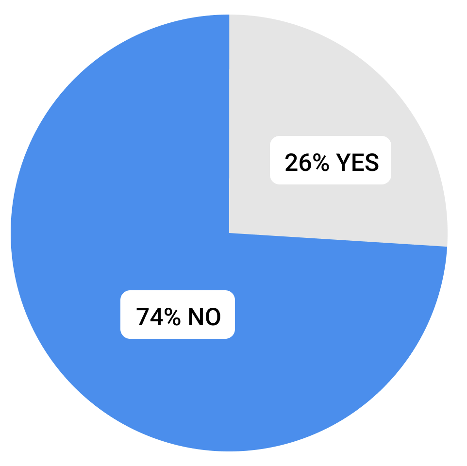
Would you wait in line to purchase snacks if you knew you would miss a part of the movie?
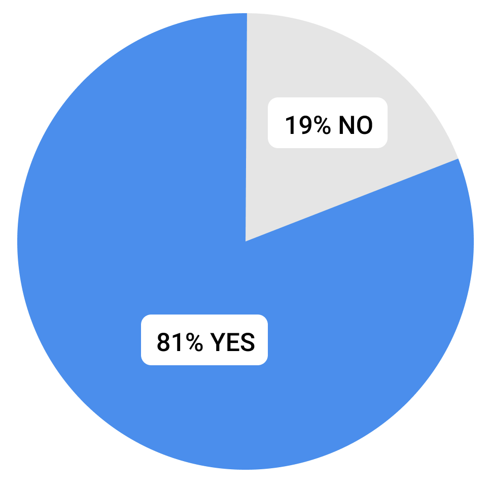
Has waiting in a concession line ever caused you to miss part of a movie?
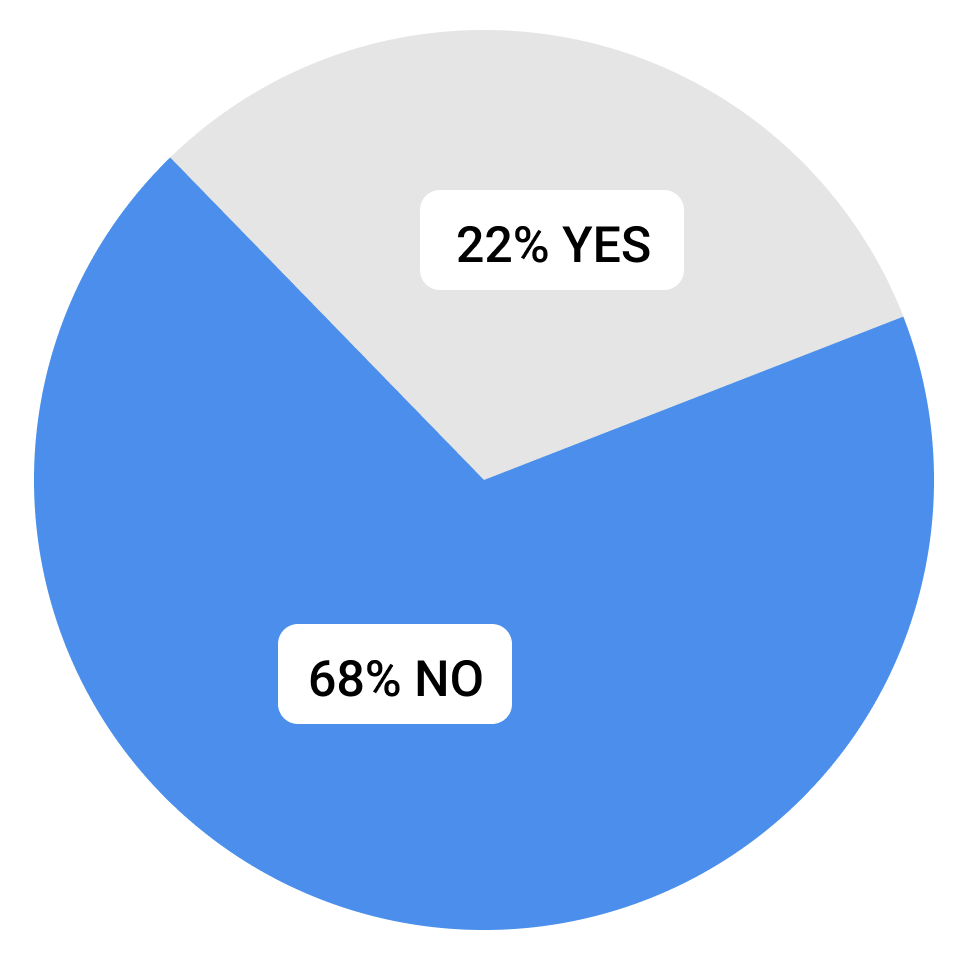
Would you leave your seat mid-movie to purchase snacks?
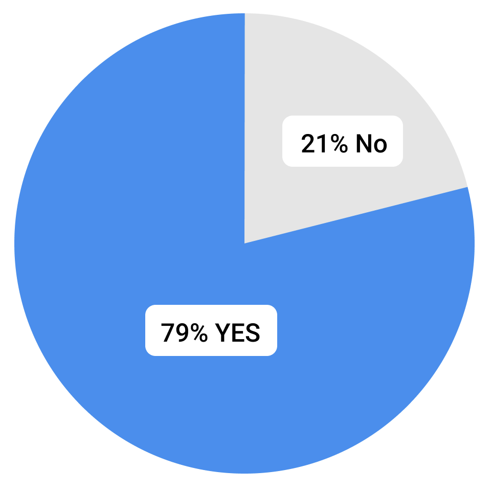
Would you purchase snacks from the theater website if they delivered them to your seat?
Secondary research
Next, I conducted a competitive audit with the top five movie theater franchises. My goal was to analyze their online food ordering user flow and identify patterns, strengths, and weaknesses. I used my data as the foundation to build on.
Define
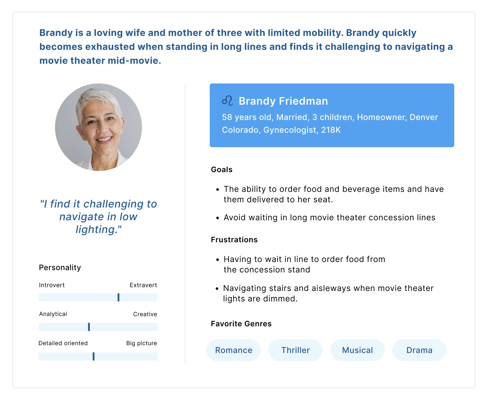
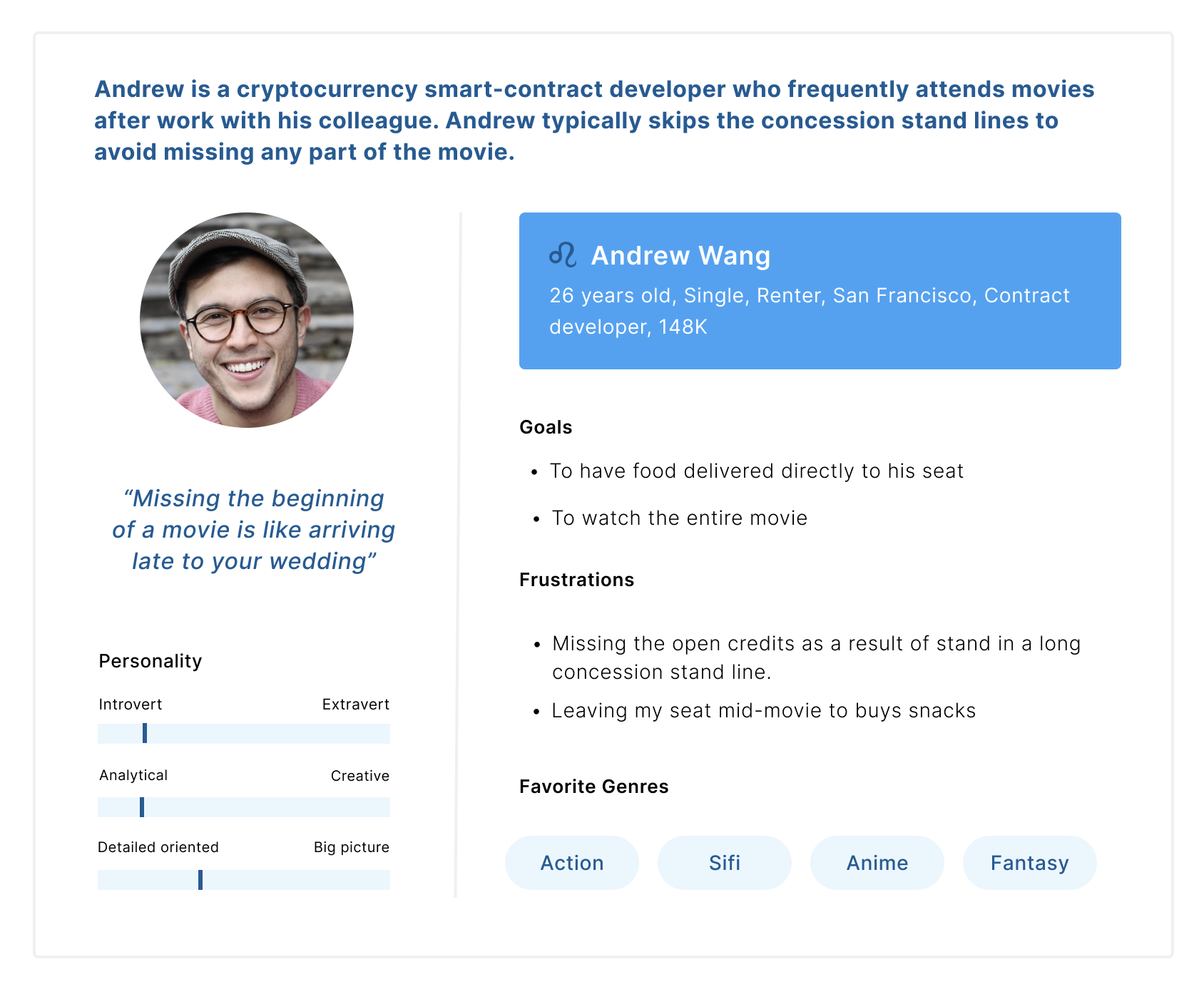
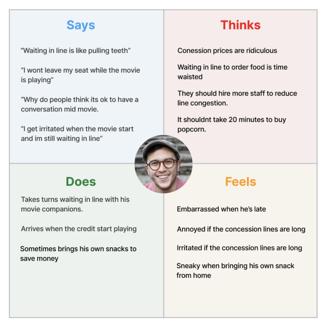
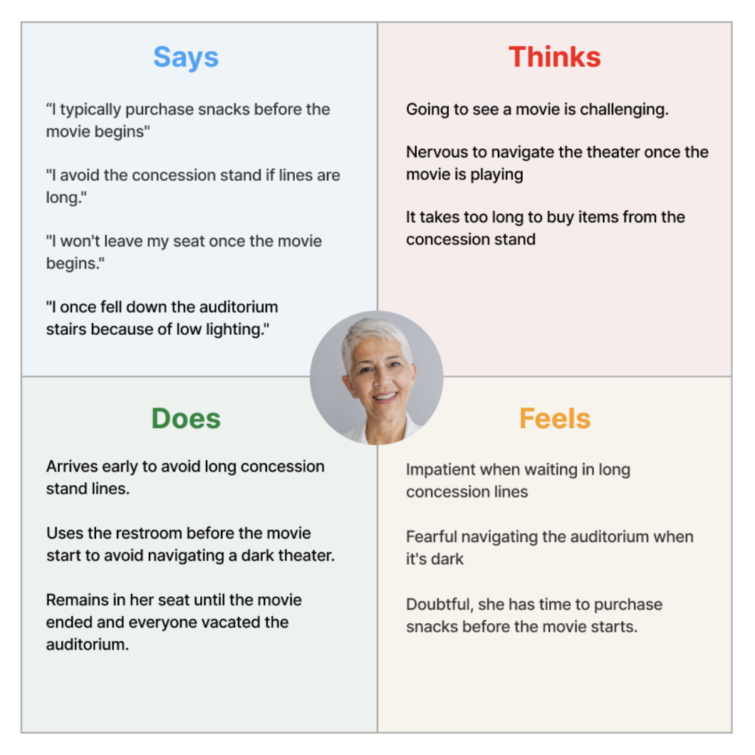
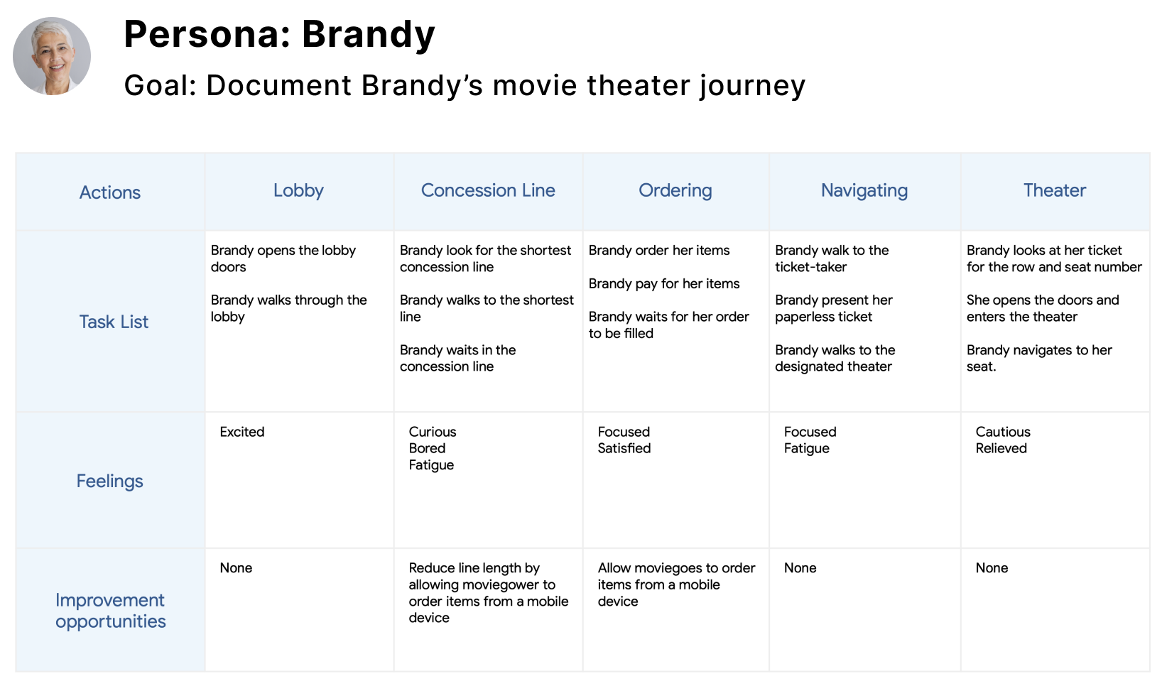
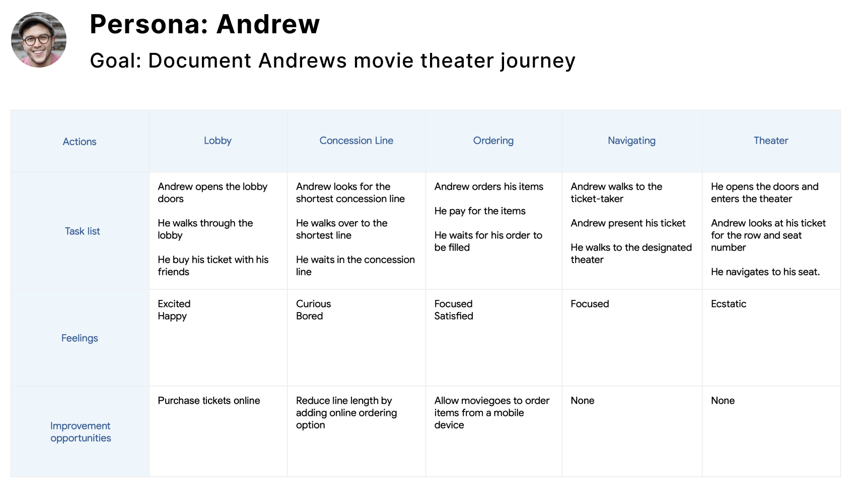
I created two personas, empathy maps and user journeys based on patterns that surfaced during the empathize phase. This process helps identify target users and understand their needs, experiences, behaviors, and goals.
Brandys problem statement
Brandy is an older woman who wants her snacks delivered to her seat because of her limited mobility.
Andrews problem statement
Andrew is a movie connoisseur, who wants to order food from his seat to avoid missing any portion of the movie.
Empathy maps
User Journey
Ideate
During the empathize and defined phases, I gained valuable insight that helped me to design a user flow that focused on solving four identified user pain points.
1): Long concession lines deter moviegoers from making purchases.
2) Long lines potentially cause customers to miss portions of the film.
3) Most moviegoers don't want to get up mid-movie to purchase items.
4) Navigating theaters is challenging for older people, especially when their hands are full.
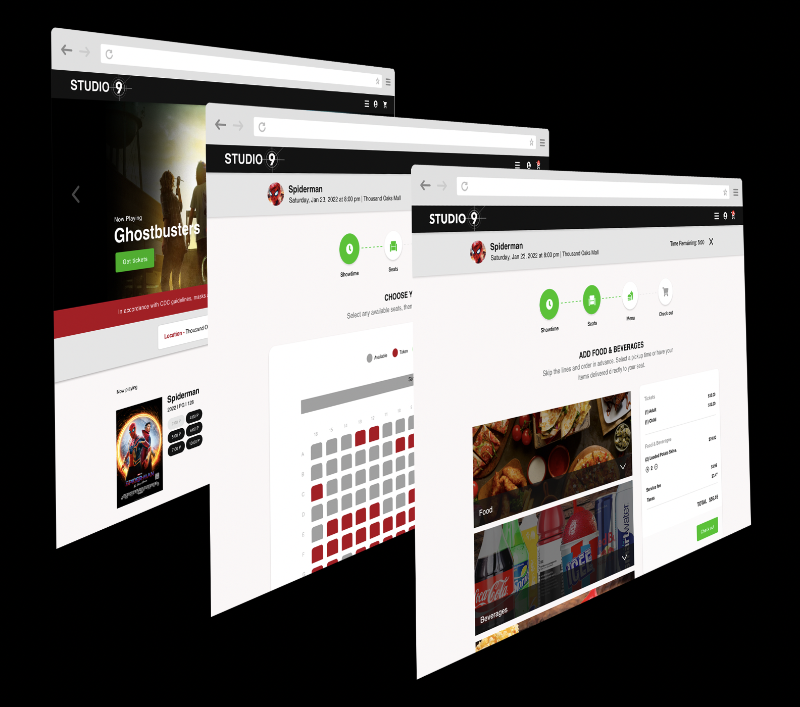
To address long lines, I design a seamless way for customers to order food and beverage while purchasing their e-tickets. Customers can either pick up their items before the movie begins or have them delivered directly to their seats. To deal with the mid-movie buyers, we place a bar code on each armrest that opens the menu for immediate seat delivery and link the order to the correct seat.
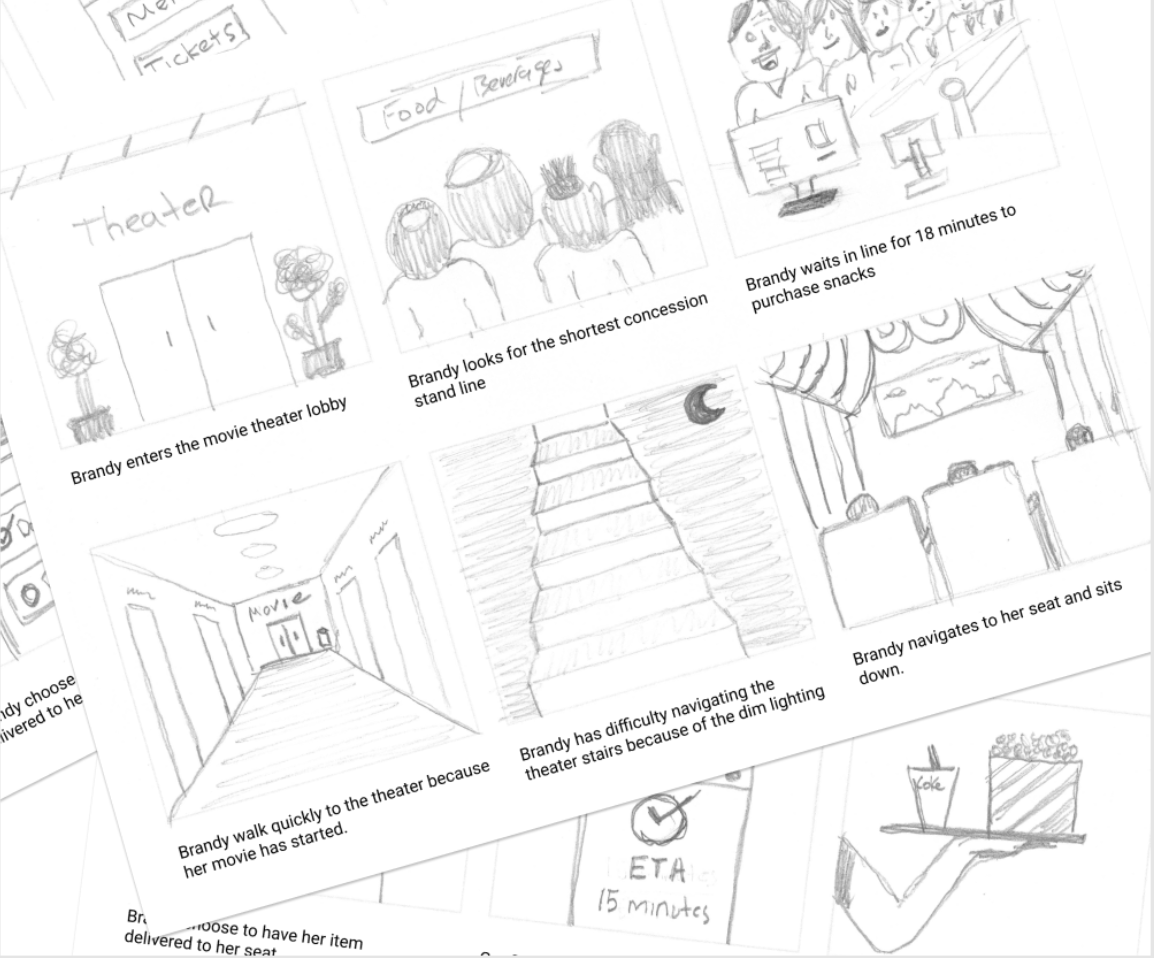
Storyboard
Scene: Brandy spent eighteen minute in line waiting to order snacks which caused her to miss the beginning of the movie.
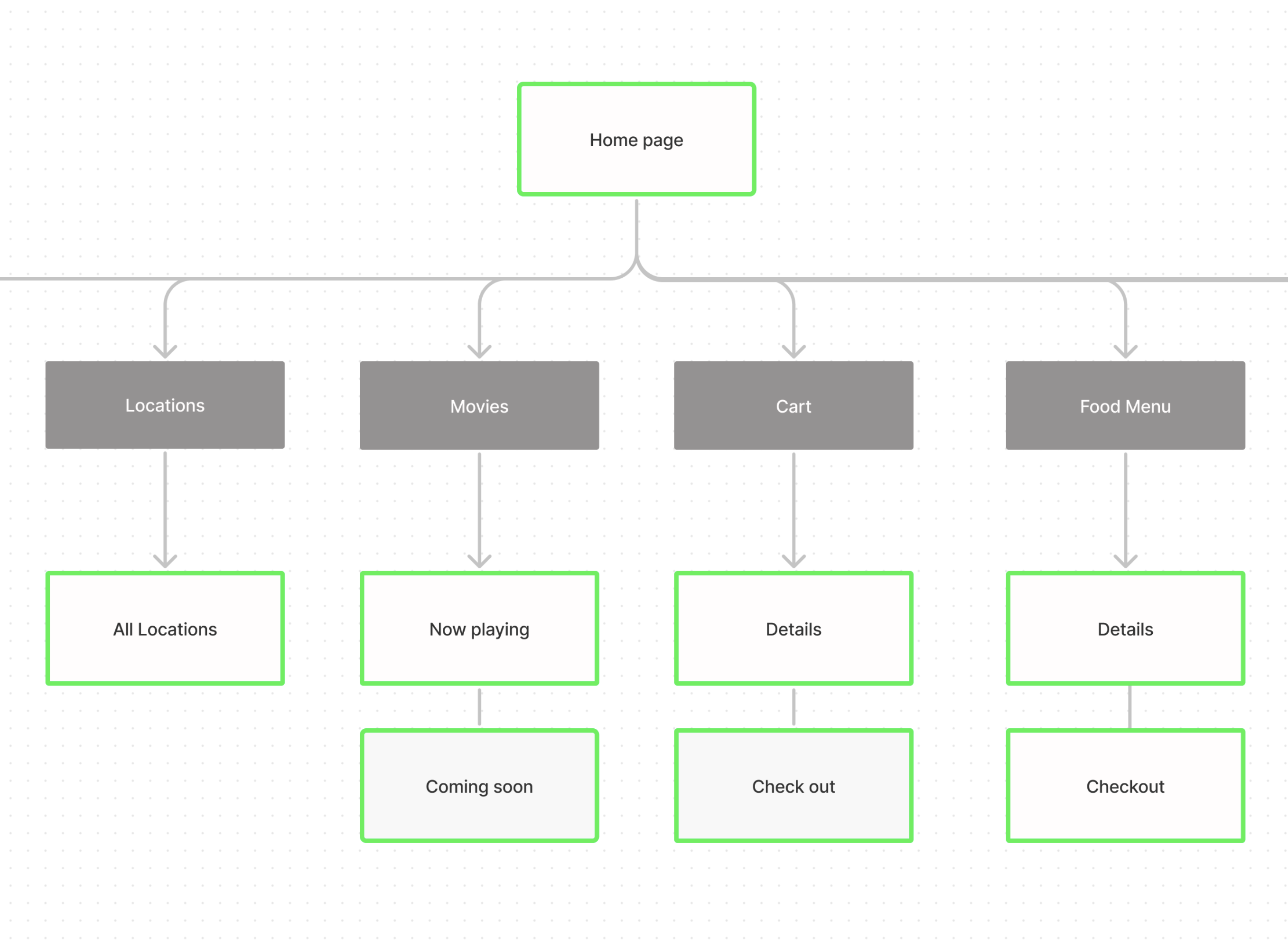
Sitemap
To ensure the site structure made sense to the end-users, I facilitated a card sorting exercise using maze.com platform and used the results to build my sitemap in figma.
Paper
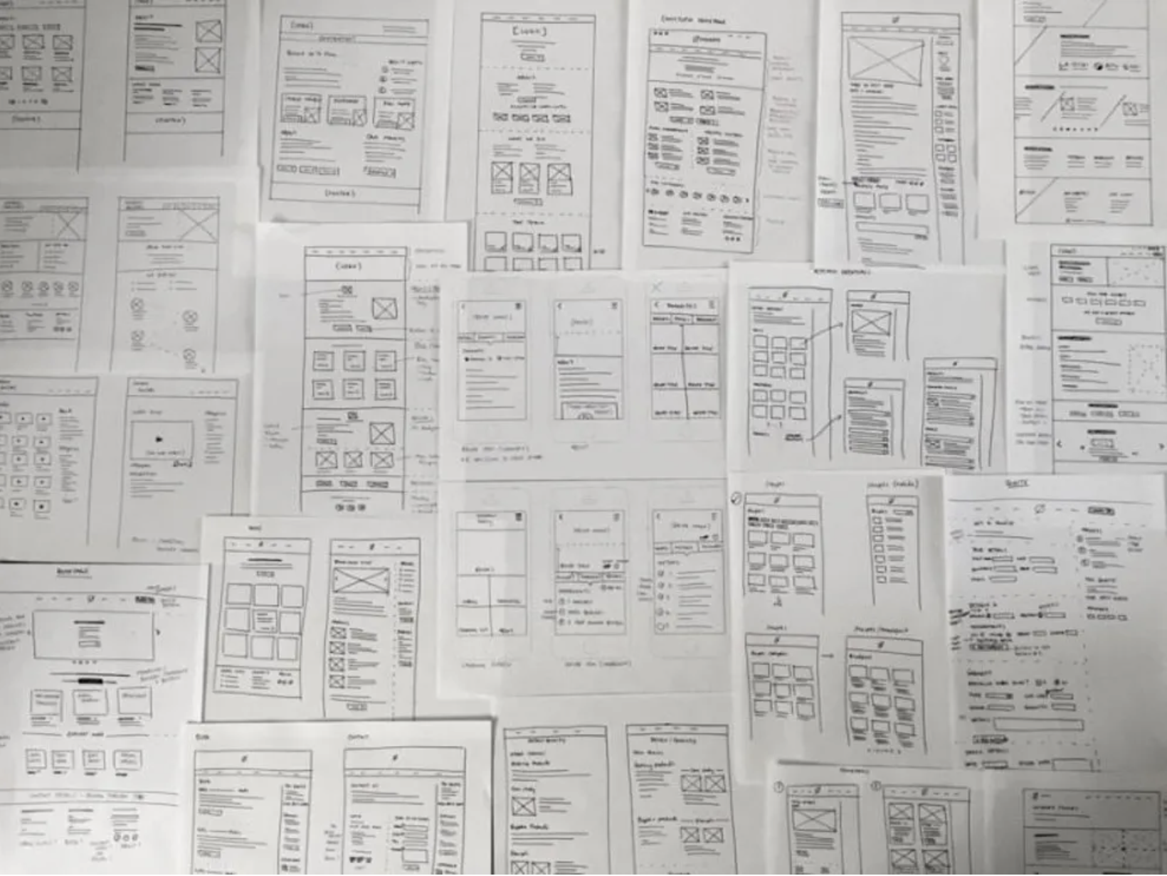
wireframes
Using Adobe XD I created paper wire frames for both the desktop and mobile user purchasing flow.
Prototype
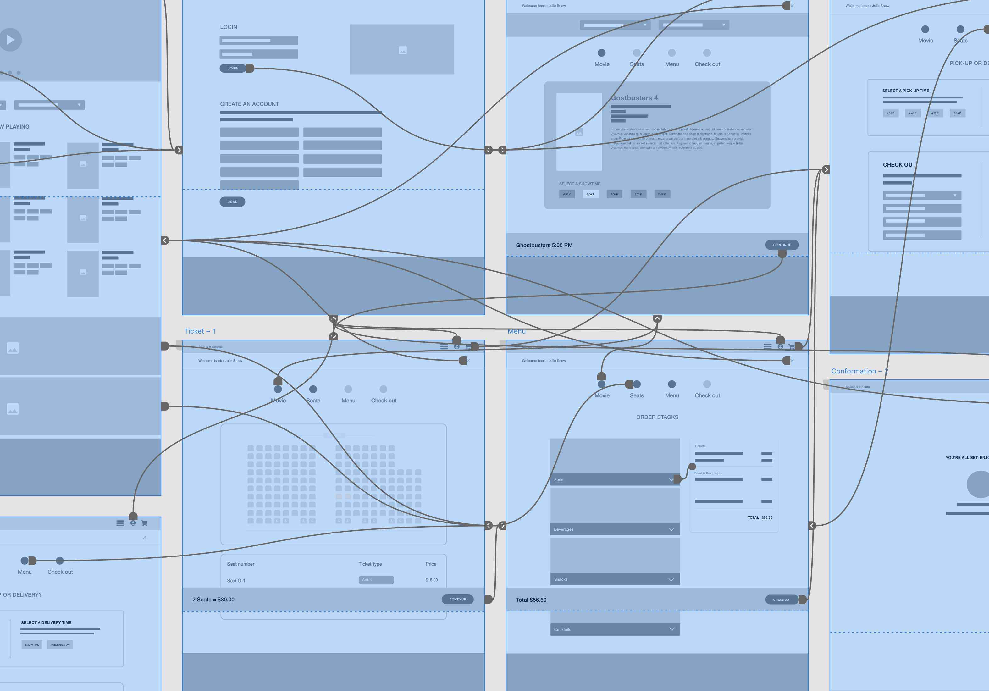
I prepared a prototype with interaction using Adobe XD which will be used for usability testing.
Usability Testing
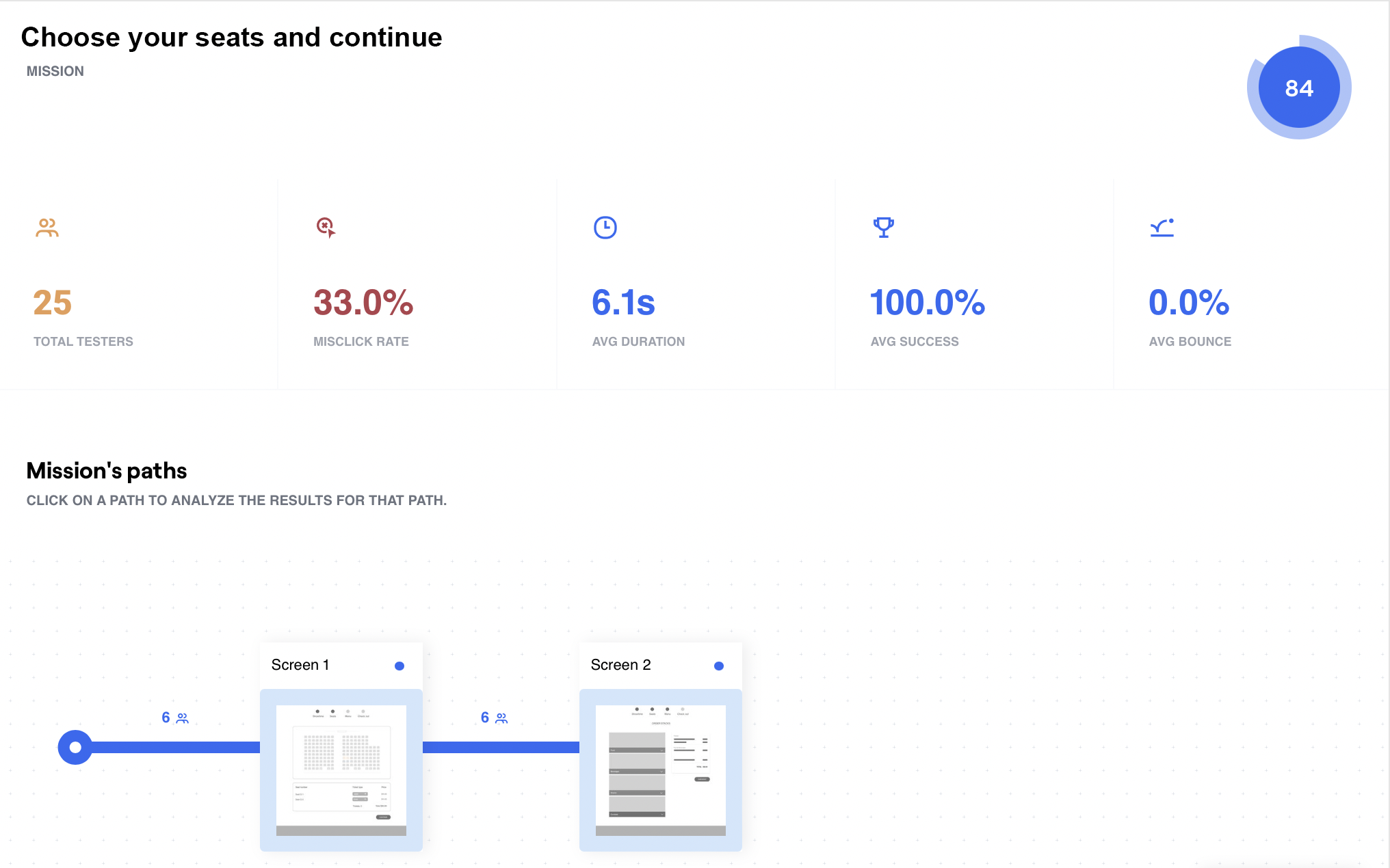
I conducted an unmonitored usability test with 25 participants using the maze.com platform. My goal was to test my hypothesis, receive user feedback, and iterate where needed.
After analyzing the data, I concluded that the participants had no issues completing the assigned tasks. There was some confusion with the language I used in my description. After improving the description text, I shared the result with the stakeholders, and we agreed to proceed with prototyping.
Mockups
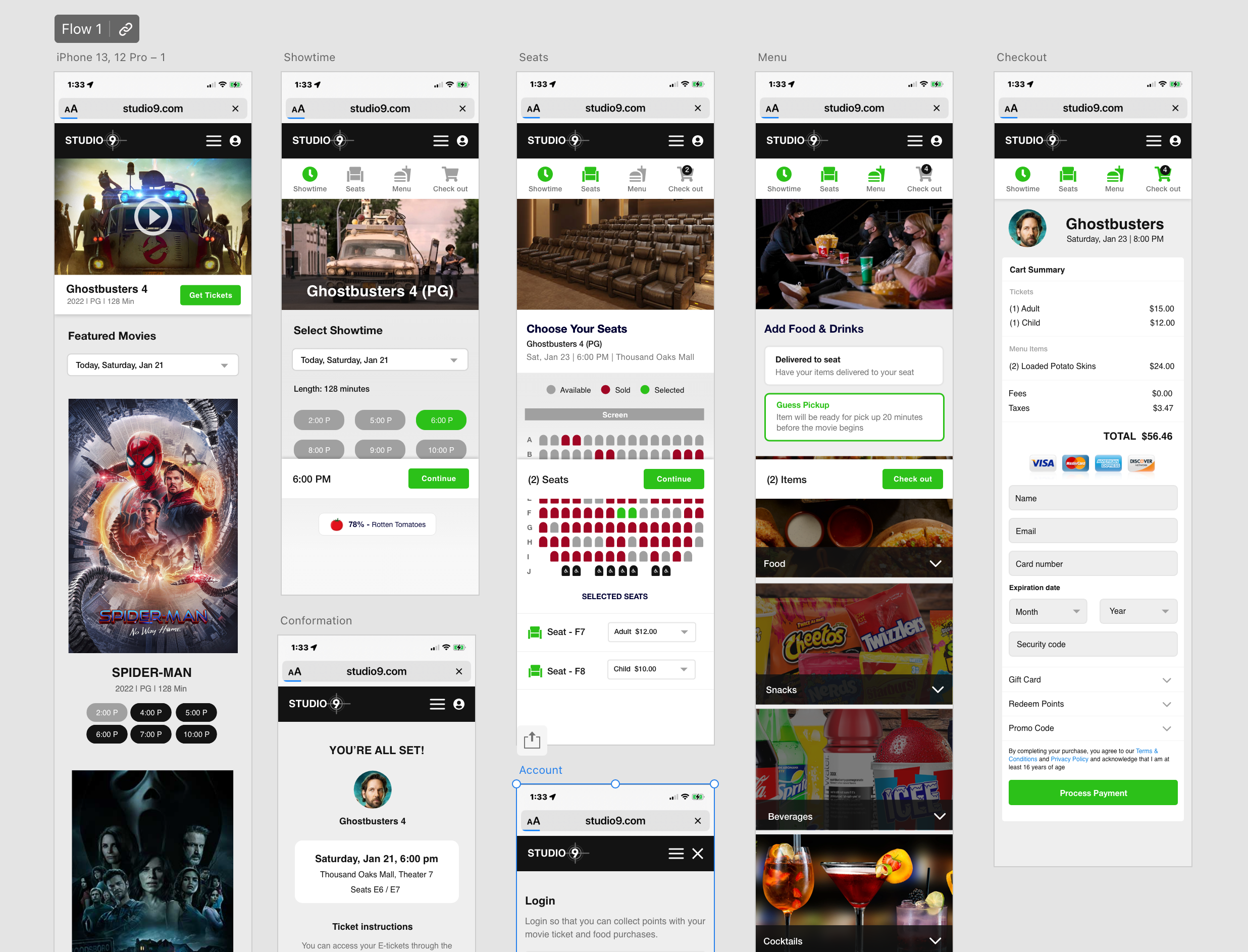
After iterating my low fidelity wireframes, I prepare high fidelity wireframes with interactions.
Responsive
Design
I created three independent flows to showcase the design on mobile, tablet, and desktop.
Design System
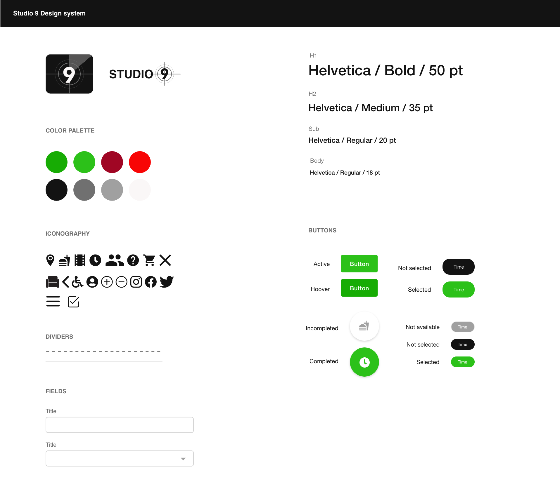
I crafted a UI kit with clear guidelines and rules that would help keep the design consistency when developing new features in the future.
Final Takeaways
If we focus on the details of the product and services, we tend to overlook the users and their perspectives. The learning point from this project was user expectations change, and if companies don't adapt to the user needs, they will gravitate to where their needs are met.
Thus, design should always go in line with user research to provide the best experience for customers.
Selected Works
Med AlertProject type
Service Bull - Home Service SoftwareProject type
Henry's Steakhouse Timesheet AppApp Design