UX case study for Henry's timesheet app
Project Overview
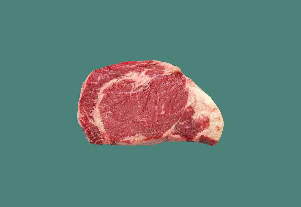
Henry's Steakhouse is a family-owned restaurant chain established in 1953 with 13 locations spread across southern Texas. They're known for their family farmed raised beef.
Problem: Henry's location managers work an average of 62 hours a week, with most of their time spent scheduling staff, which prevents them from completing other essential tasks. Employee turnover rates are increasing due to a lack of flexibility with their hours. Under-staffed locations turn away customers resulting in negative online reviews and lost revenue.
Goal: Design a timesheet app that allows Henry's employees to independently schedule the days and hours that work best for them. If needed, employees can responsibly modify their schedules, ultimately reducing manager workload and improving employee turnover rates.
Project Duration: November 1st - December 15th
My Role: UX/UI designer
Responsibilities: Monitored interviews, competitive audit, user personas, journey maps, wireframing, prototyping, conducting usability testing, and iterating on designs.
Discovery
Stakeholder interview
I had one-on-one conversations with Henry's stakeholders. The goal was to extract information from three main areas, user needs, business goals, and technical limitations. After several discussions, we set clear goals, established milestones, and prioritized tasks.
User Interviews
I conducted moderated interviews with Henry's staff. The goal was to empathize with their needs and identify pain points. Participants were between 22-51 years of age, two location managers, five food servers, two busboys, and one hostess. The individual interviews were conducted through zoom.
Secondary research
I conducted a competitive audit of the top five timesheet apps to identify their strengths and weaknesses and compare user flows and feature sets. Then, I analyzed their public reviews to identify patterns and joined their private Facebook groups to observe users' feature requests and upcoming releases.
Explore
To help communicate information about users that I collected during the discovery phase, I created two provisional personas, problem statements and user journey maps from both a manager and food server perspective.
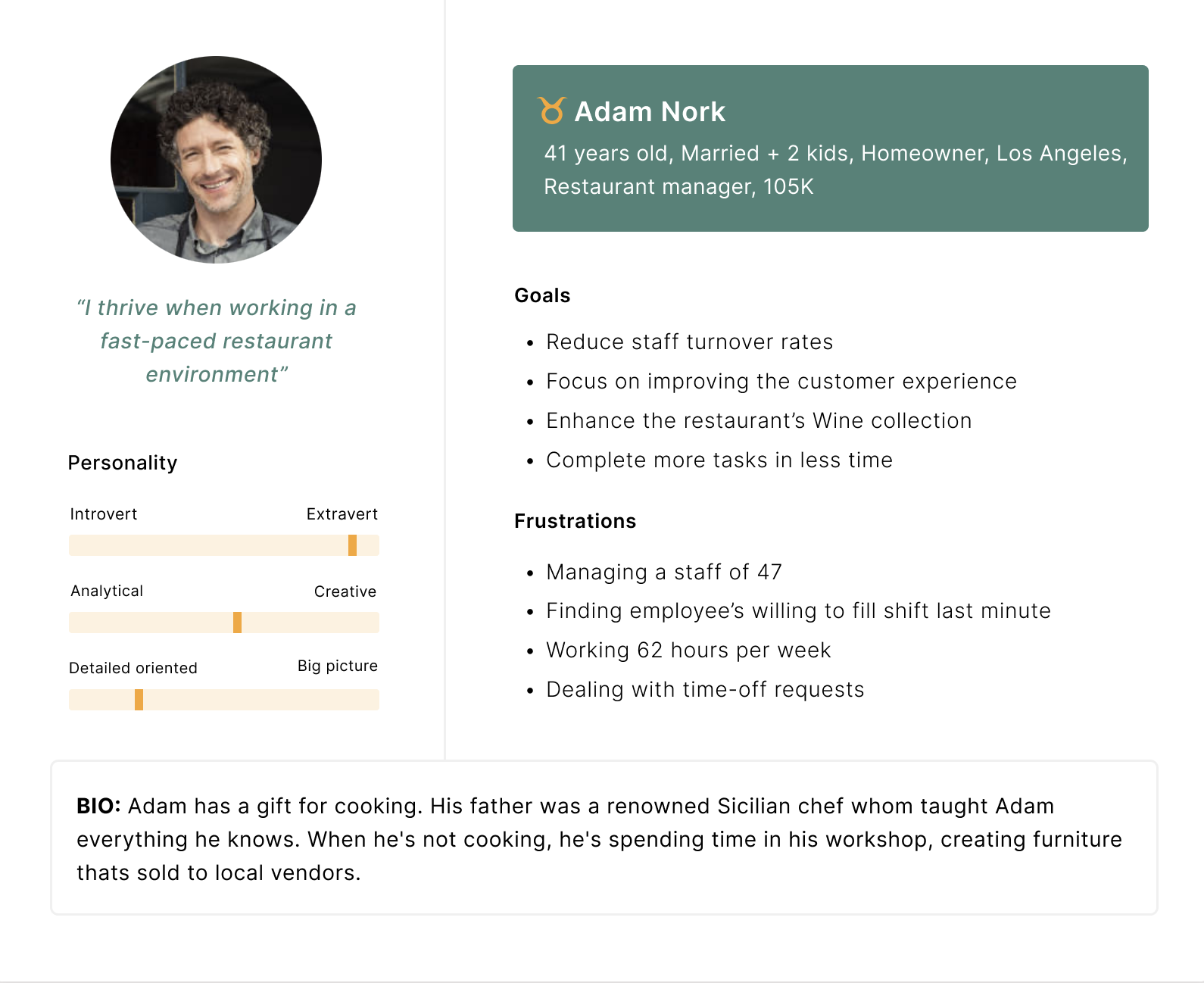
Adam's problem statement
Adam Novac is a restaurant manager who spends most of his days managing employees' schedules, preventing him from completing other tasks.
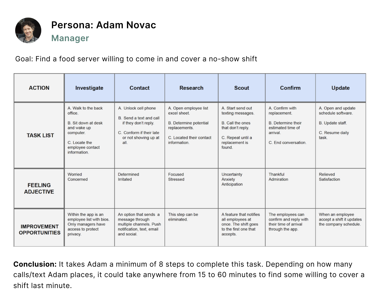
Persona
Journey map
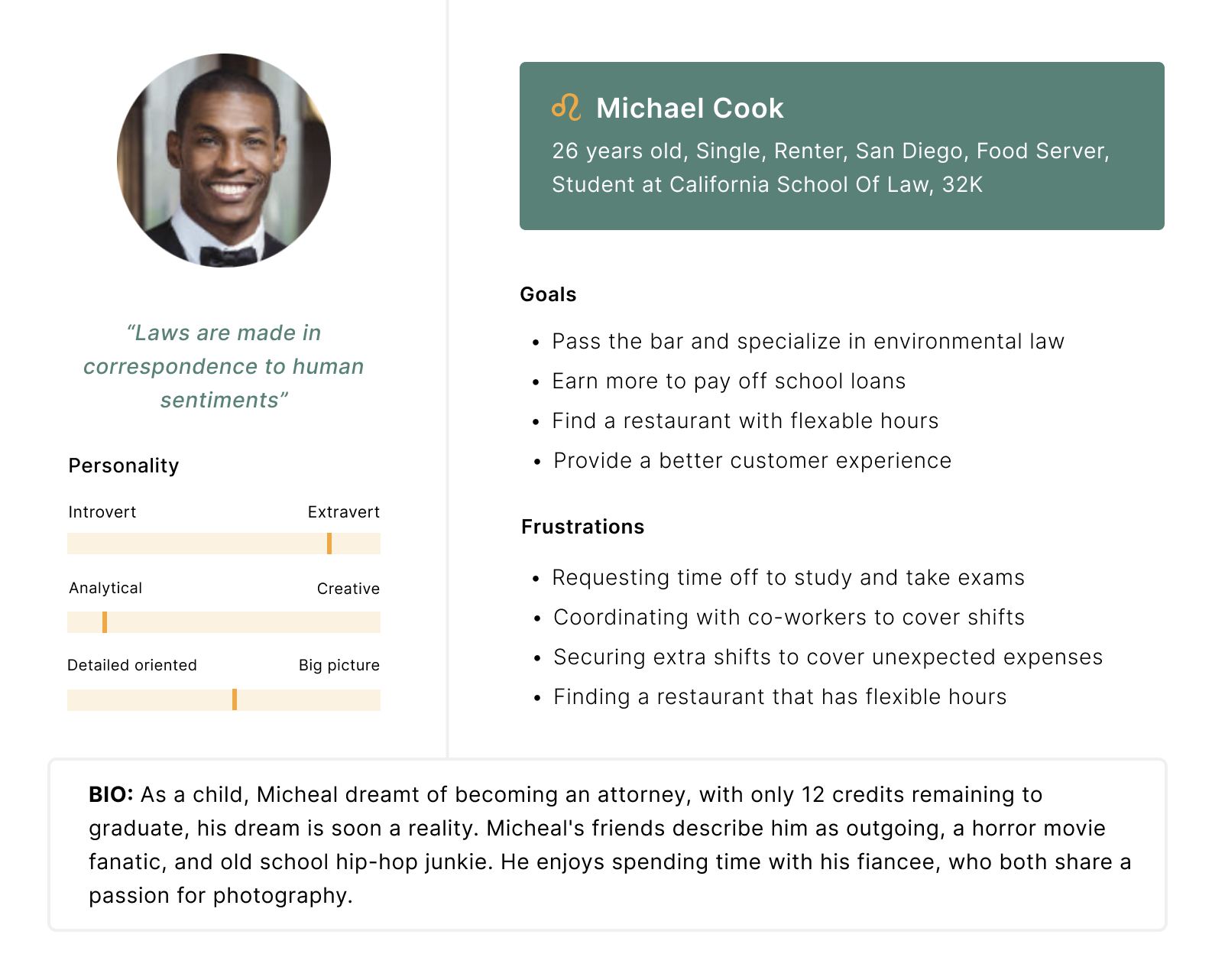
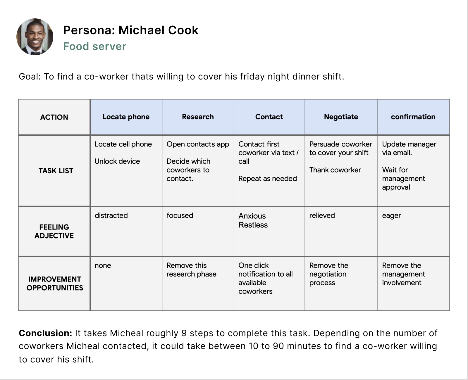
Micheal's problem statement
Micheal cook is a food server who finds it challenging cordinating with co-workers when he needs time off from work.
Persona
Journey map
Design Process
Based on the insight gained during the research phase, I now have a solid understanding of the user's needs and pain points. I started by focusing my attention on solving the four main issues Henry is currently facing.
Pain points.
- Managers spend too much time scheduling.
- Employees want the flexability to choose which days they work.
- Employees struggle to find coworkers to cover their shifts.
- Understaff locations are driving away customers.
Now it's time to translate my ideas on paper. I started ideating with how-might-we (HMW) questions, then moved into crazy-8 exercises to get ideas flowing then storyboards, sitemaps, and wireframes.
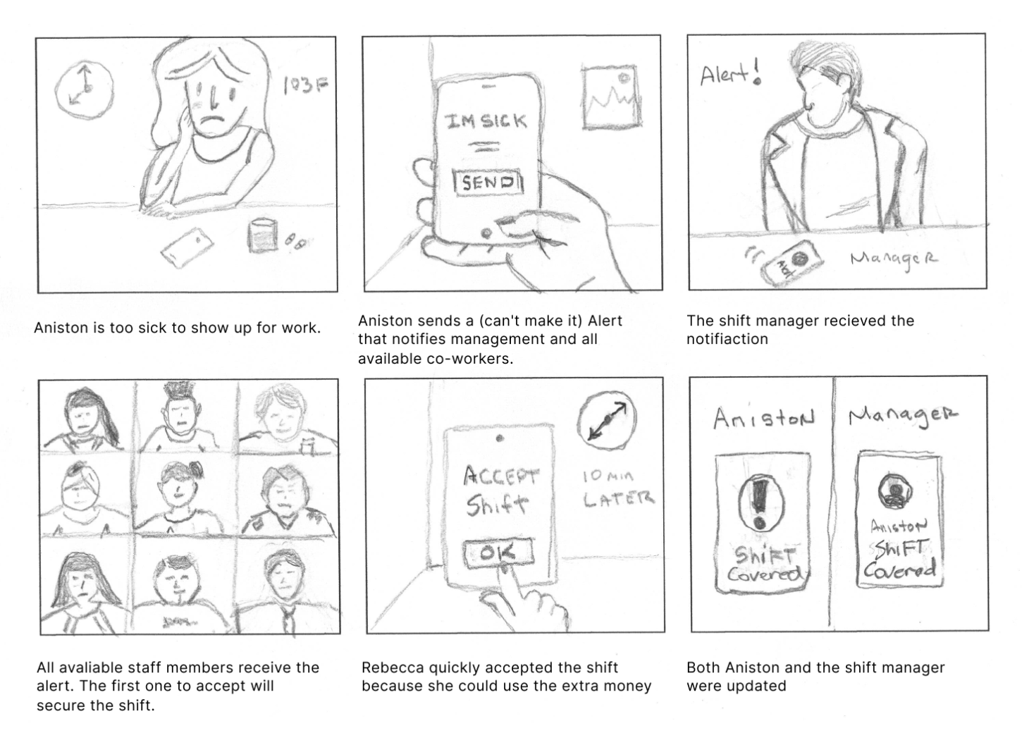
Storyboard
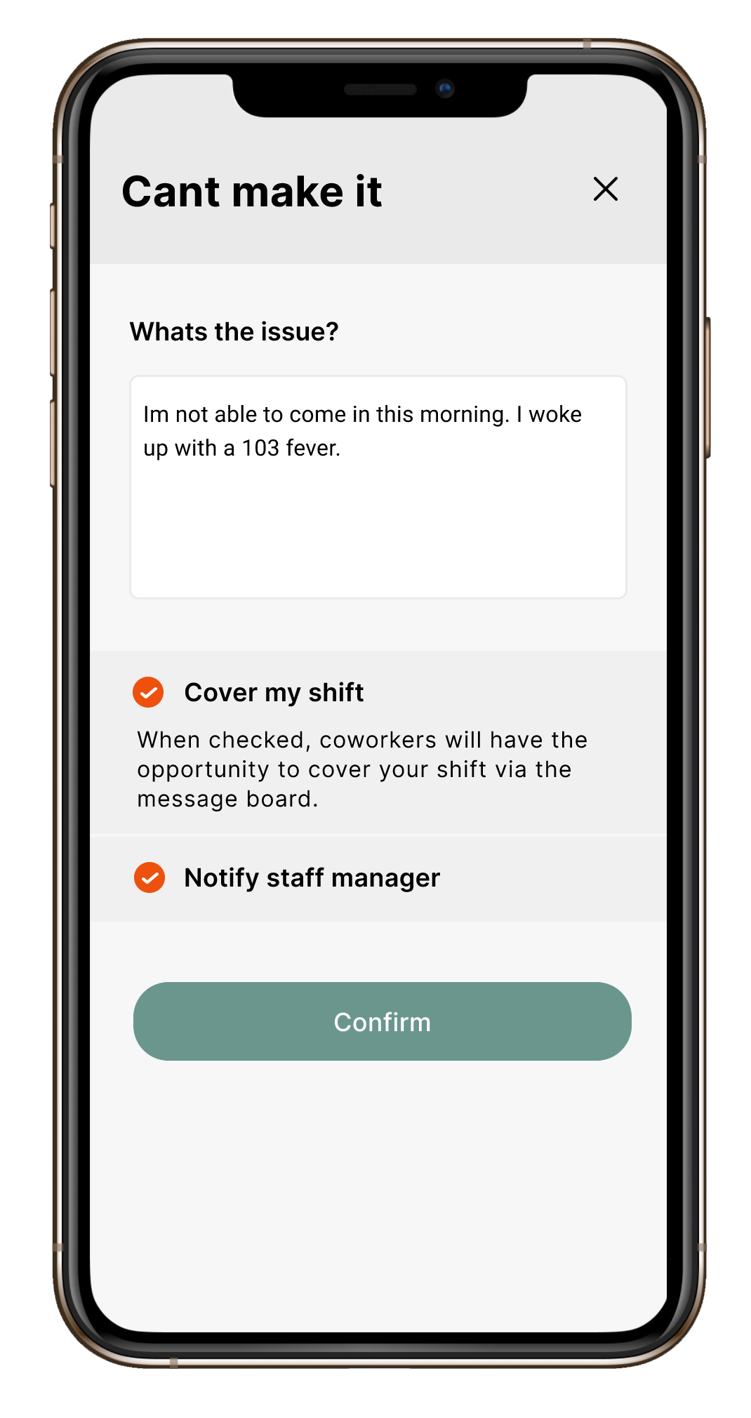
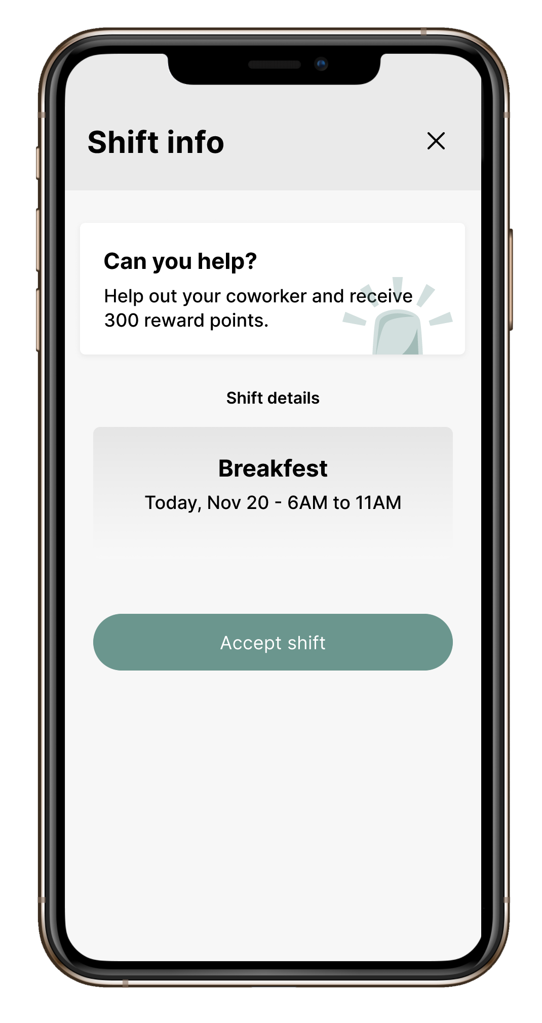
Scene: Aniston woke with a 103 fever and needed a replacement to cover her shift that starts in one hour. Thanks to Herny's new timesheet app, she can notify all available coworkers with one click, increasing her odds of finding a replacement in time.
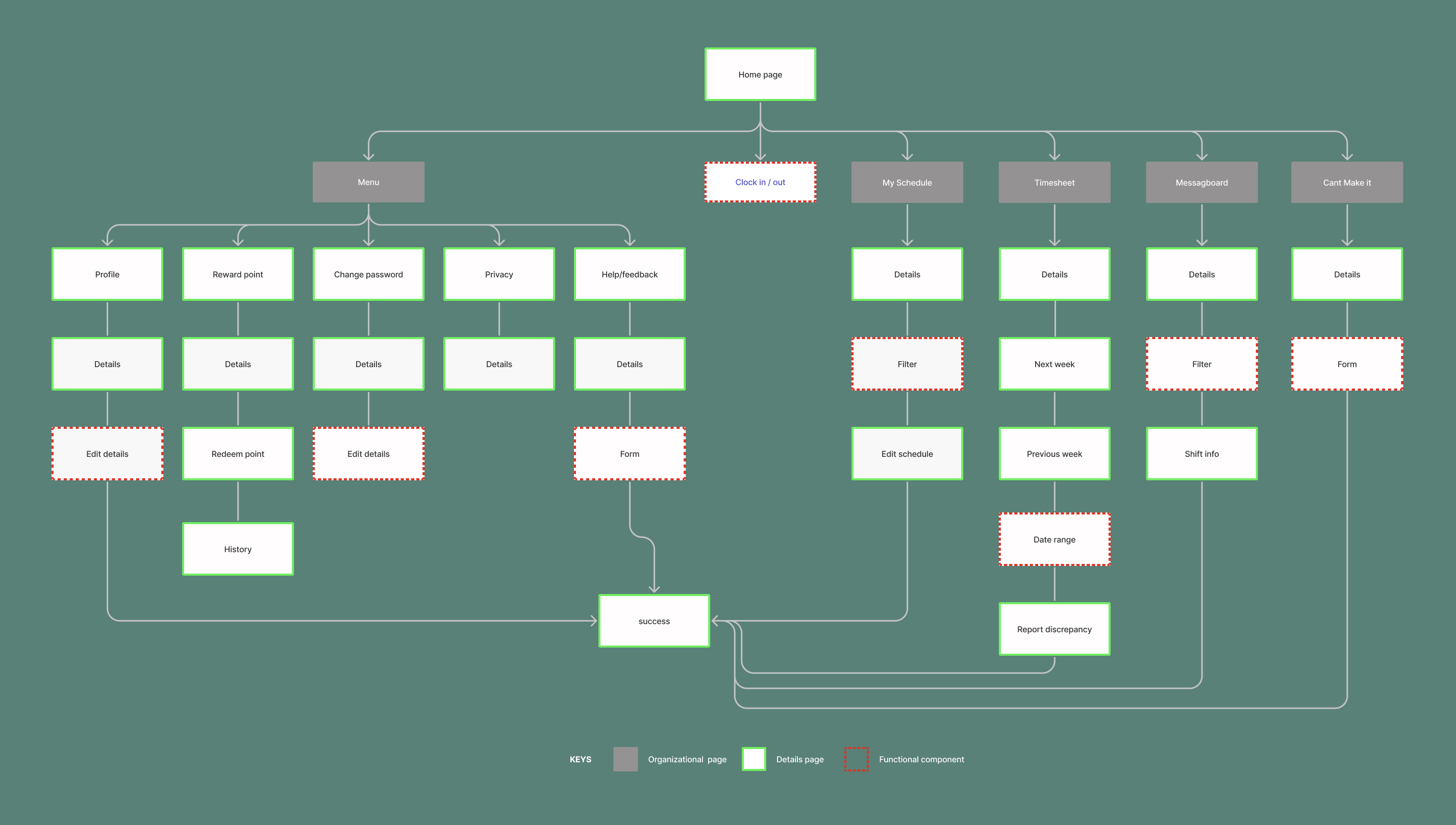
Sitemap
To ensure the app is easy to navigate, I start by creating a sitemap that layouts the app hierarchy before moving on to paper wireframes.
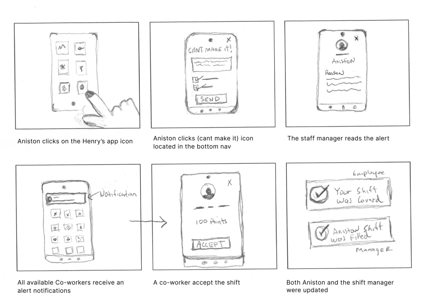
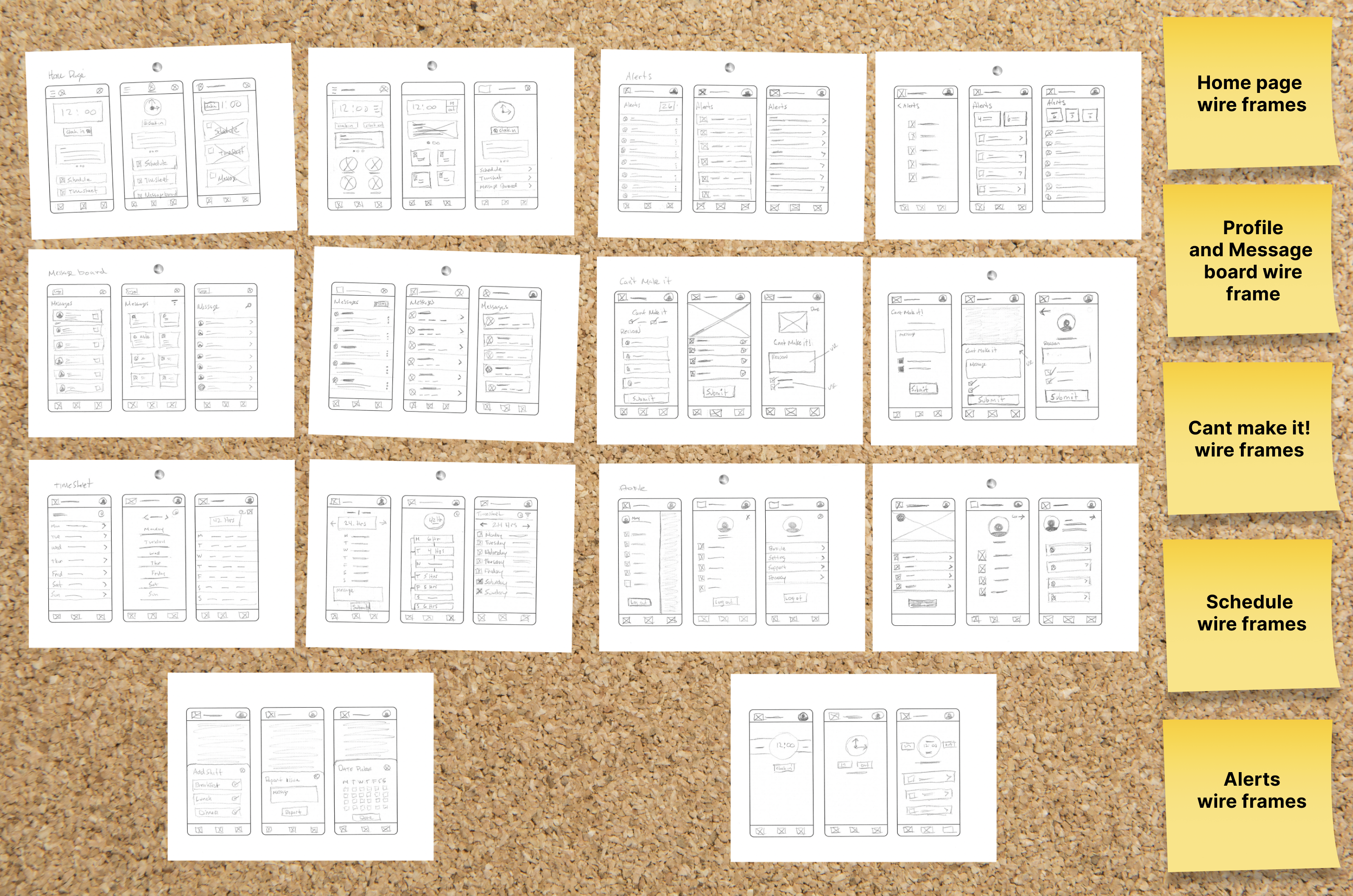
Paper wireframes
I created paper wireframes to quickly design the basic structure for each page in the project and then presented them to the stakeholder for approval.
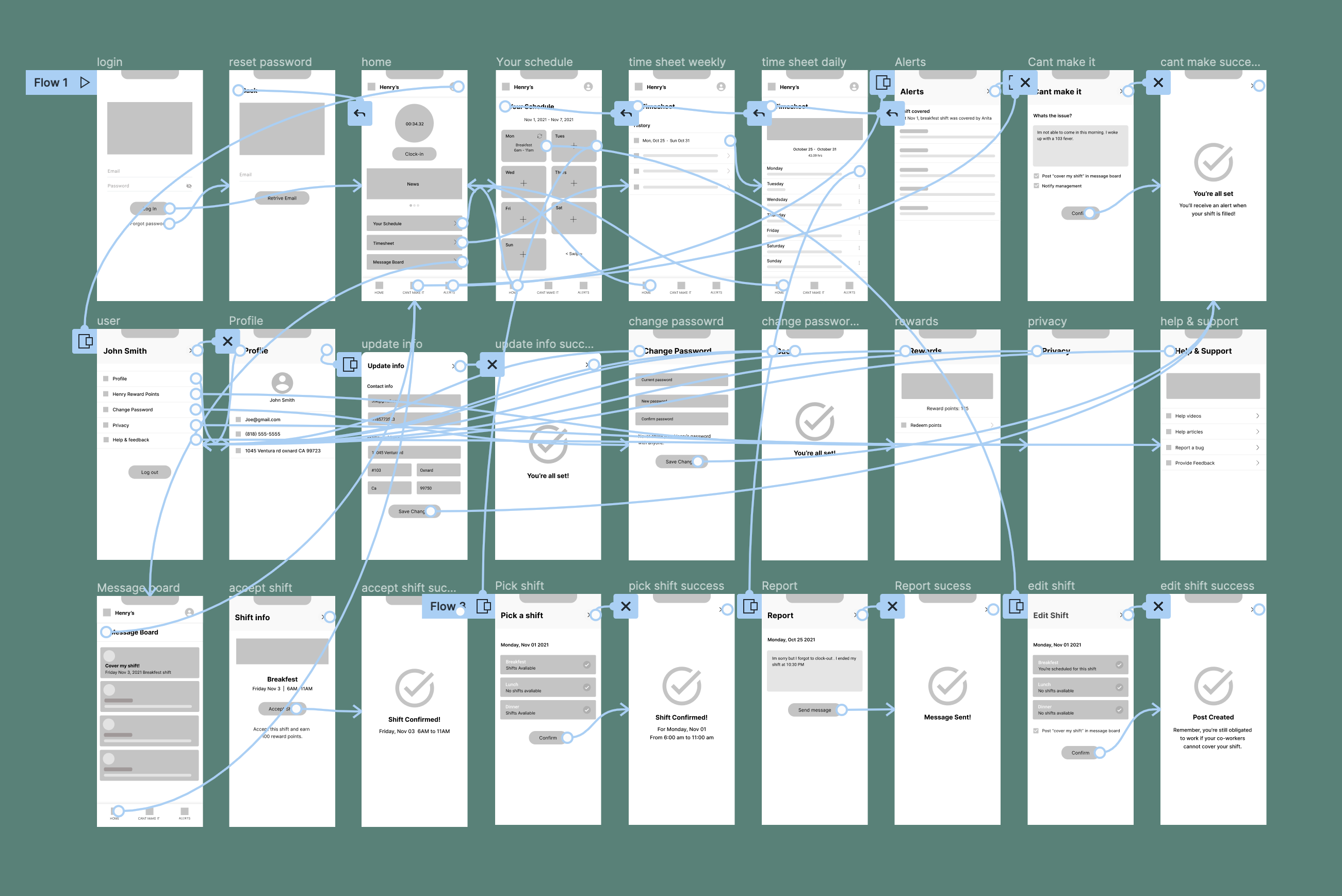
Prototype
After iterating my low-fidelity wireframes, I prepare a prototype with interactions. The prototype will undergo a usability test and be presented to Henry's shareholders.
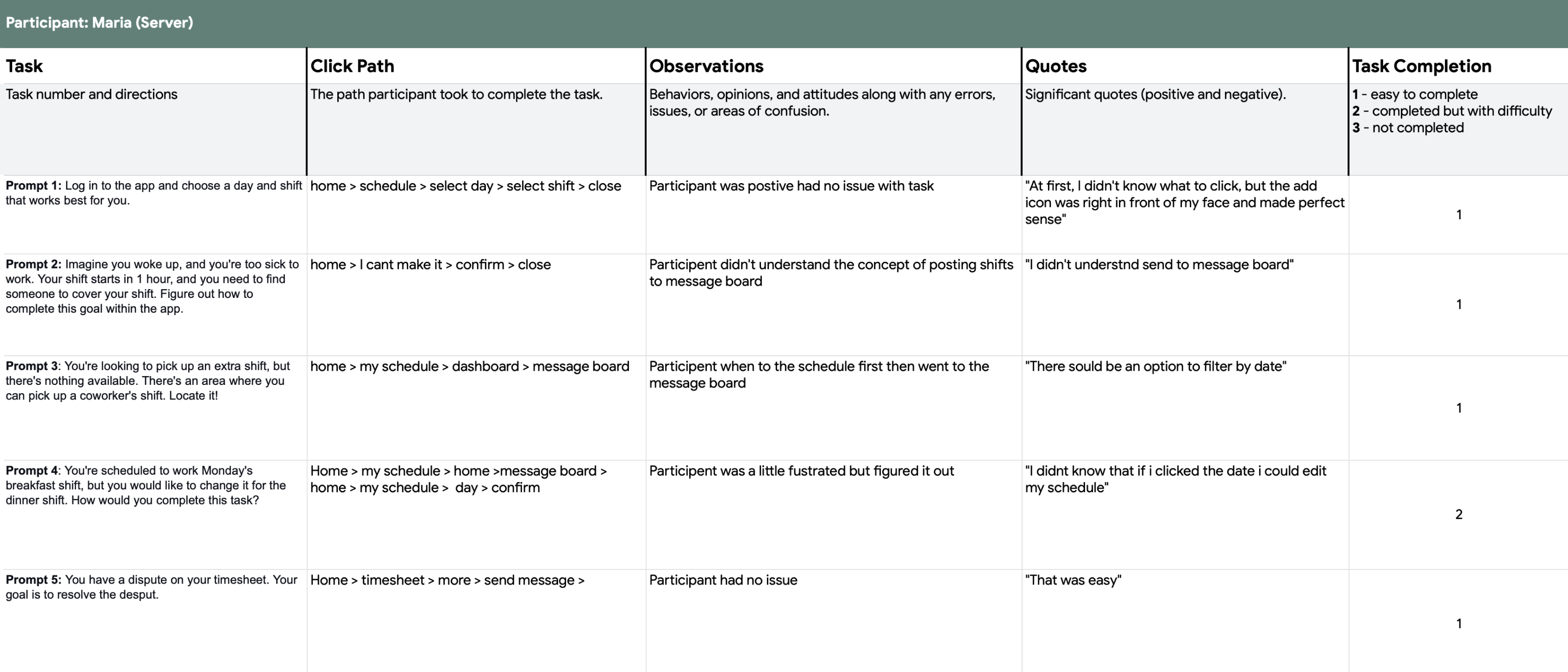
Usability Testing
I conducted a monitored usability study with Henry's employees. My goal was to test my hypothesis, receive user feedback, and iterate where needed. I decided to use new participants to prevent friendliness bias. The ten participants completed five tasks that addressed the main pain points identified during the research phase.
Research Synthesis
After our interview I grouped and categorised the data into an Affinity Map which enabled me to have a clearer understanding of the user experience.
Issue 1
6/10 participants didn't understand what steps to take when finding a coworker to cover their shift. 2/10 participants suggested adding the shift start and end time. I resolved the issues by rewording the section for clarification.
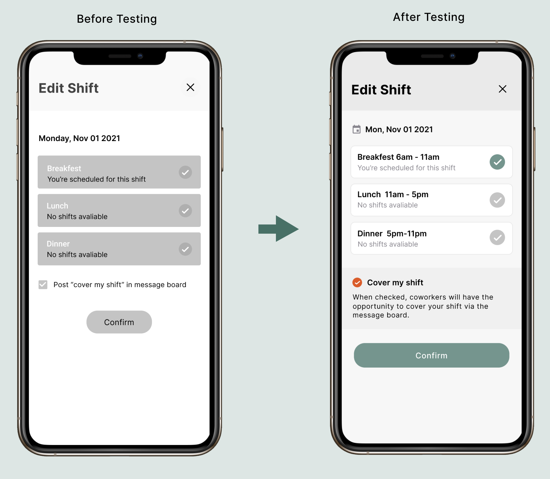
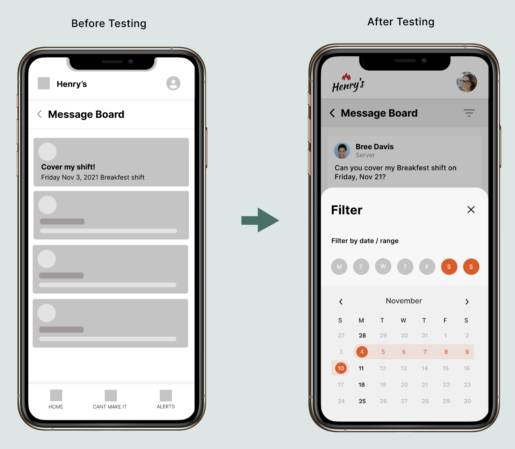
Issue 2
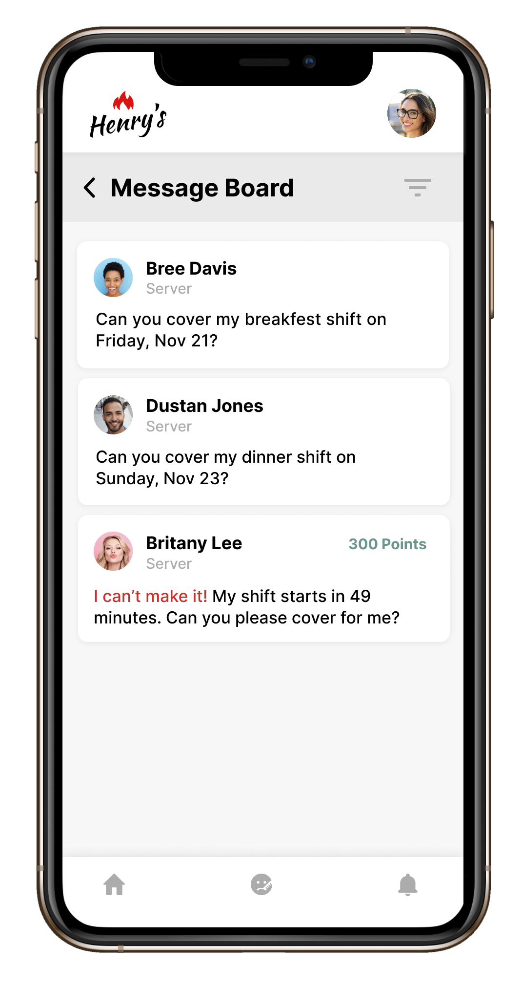
During the user testing phase, it became clear that navigating the message board was limited. I solved the issue by adding a filter that made it easier for users to find shifts that aligned with their needs.
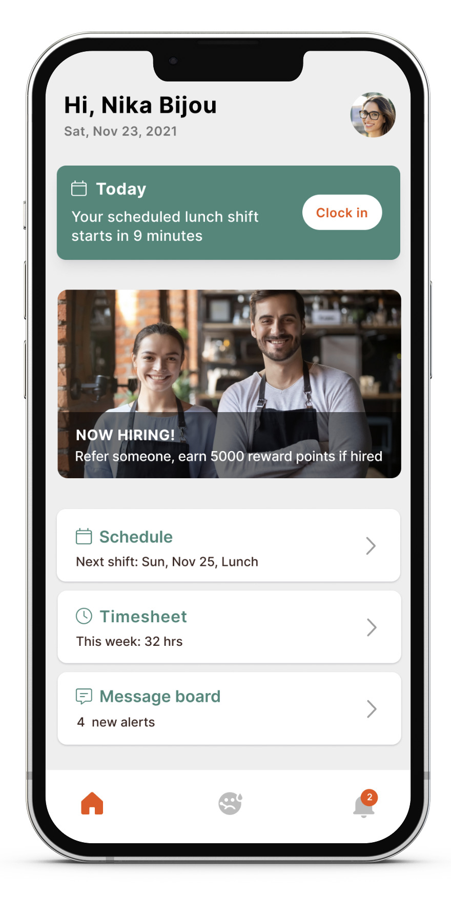
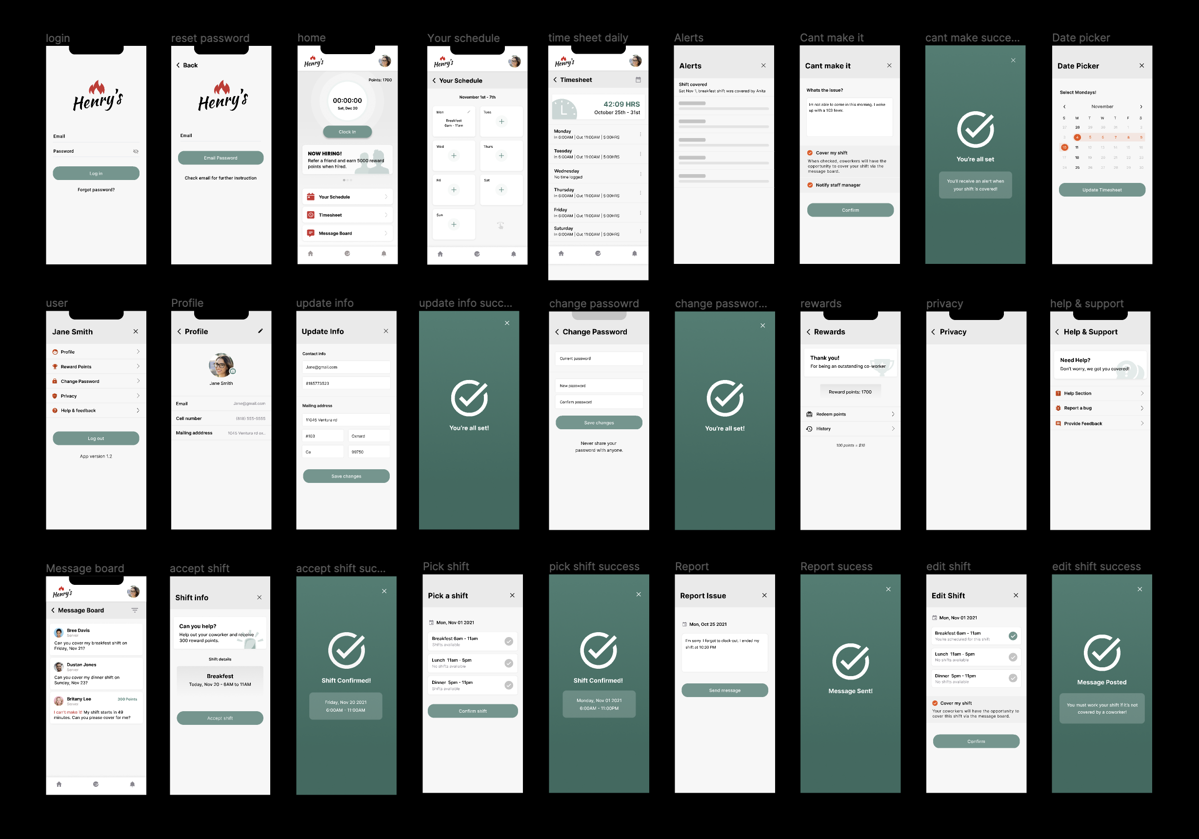
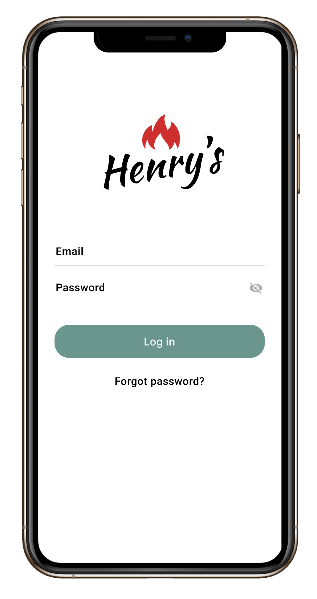
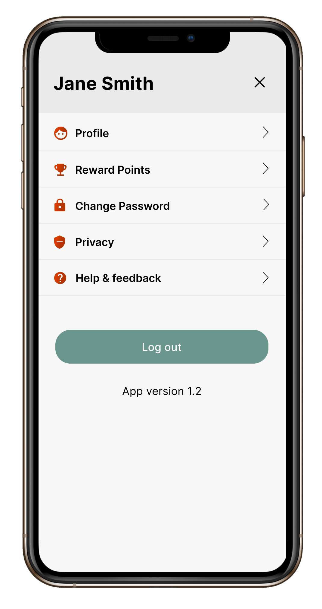
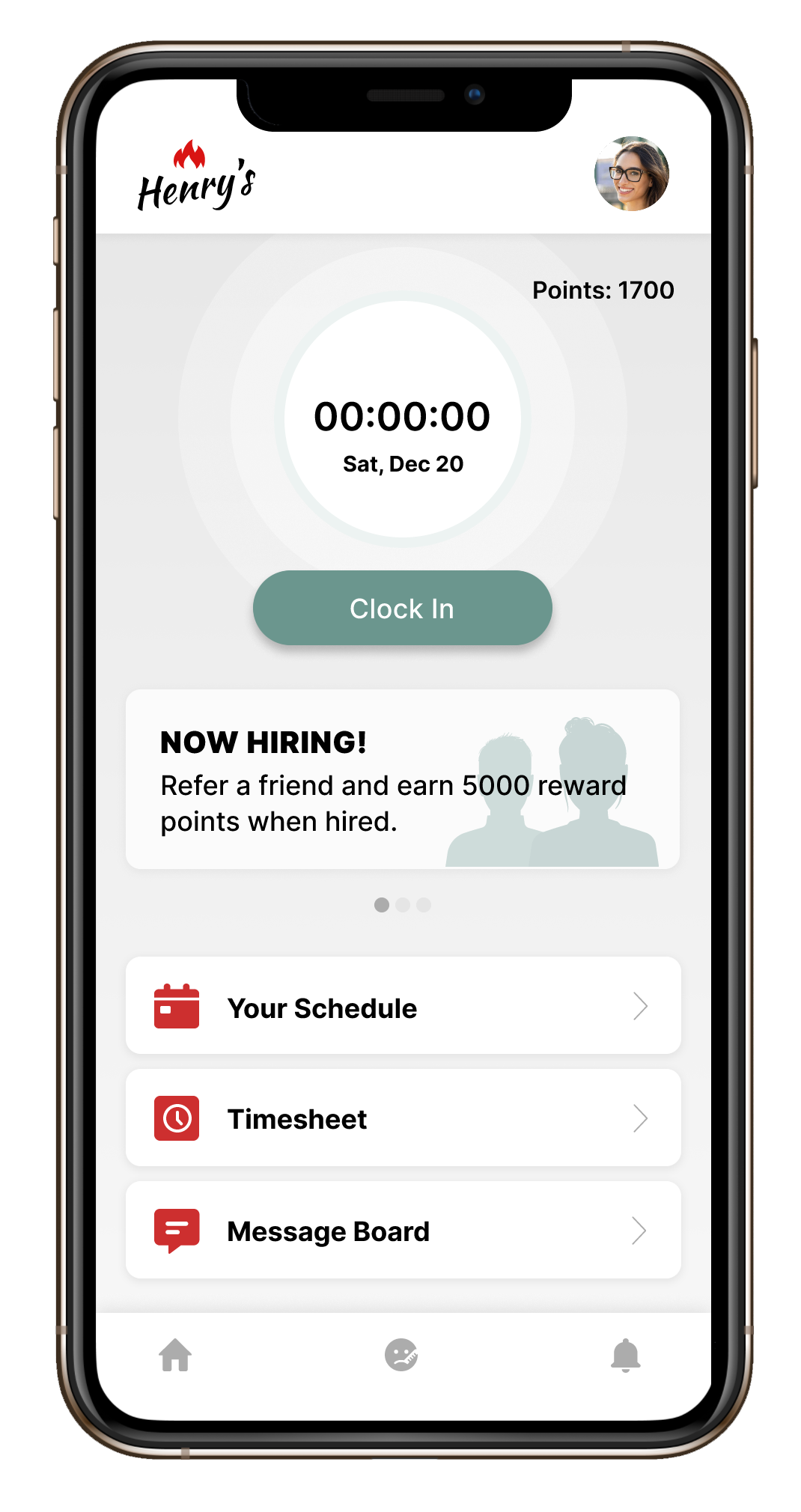
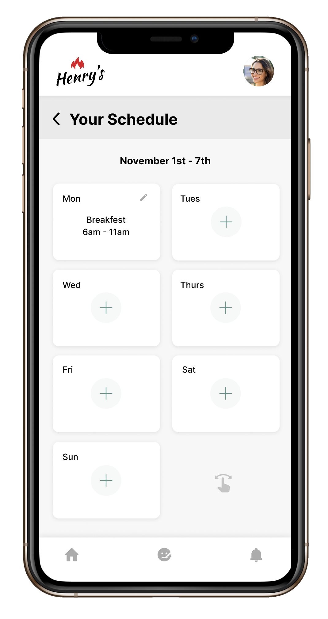
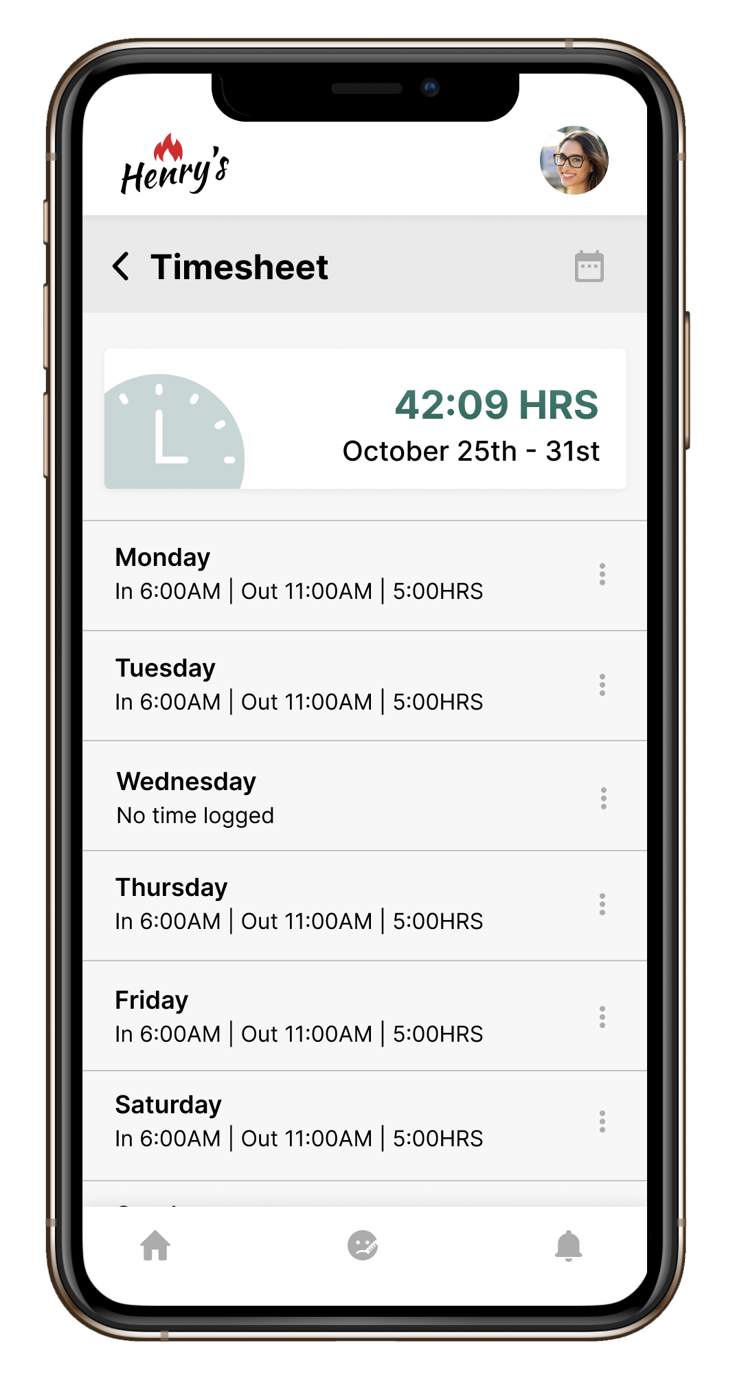
Mockups
I finalized my mockups using Henry's current design system and prepared for handoff to their developers.
XLarge
Hey there, this is the default text for a new paragraph. Feel free to edit this paragraph by clicking on the yellow edit icon.
Selected Works
Med AlertProject type
Service Bull - Home Service SoftwareProject type
Henry's Steakhouse Timesheet AppApp Design